


There is a kind of website that wins design awards and loses its owner money. Big fonts, slow scroll animations, ambient video backgrounds, abstract photography. Beautiful. Quietly catastrophic for booking jobs.
The premeditation principle
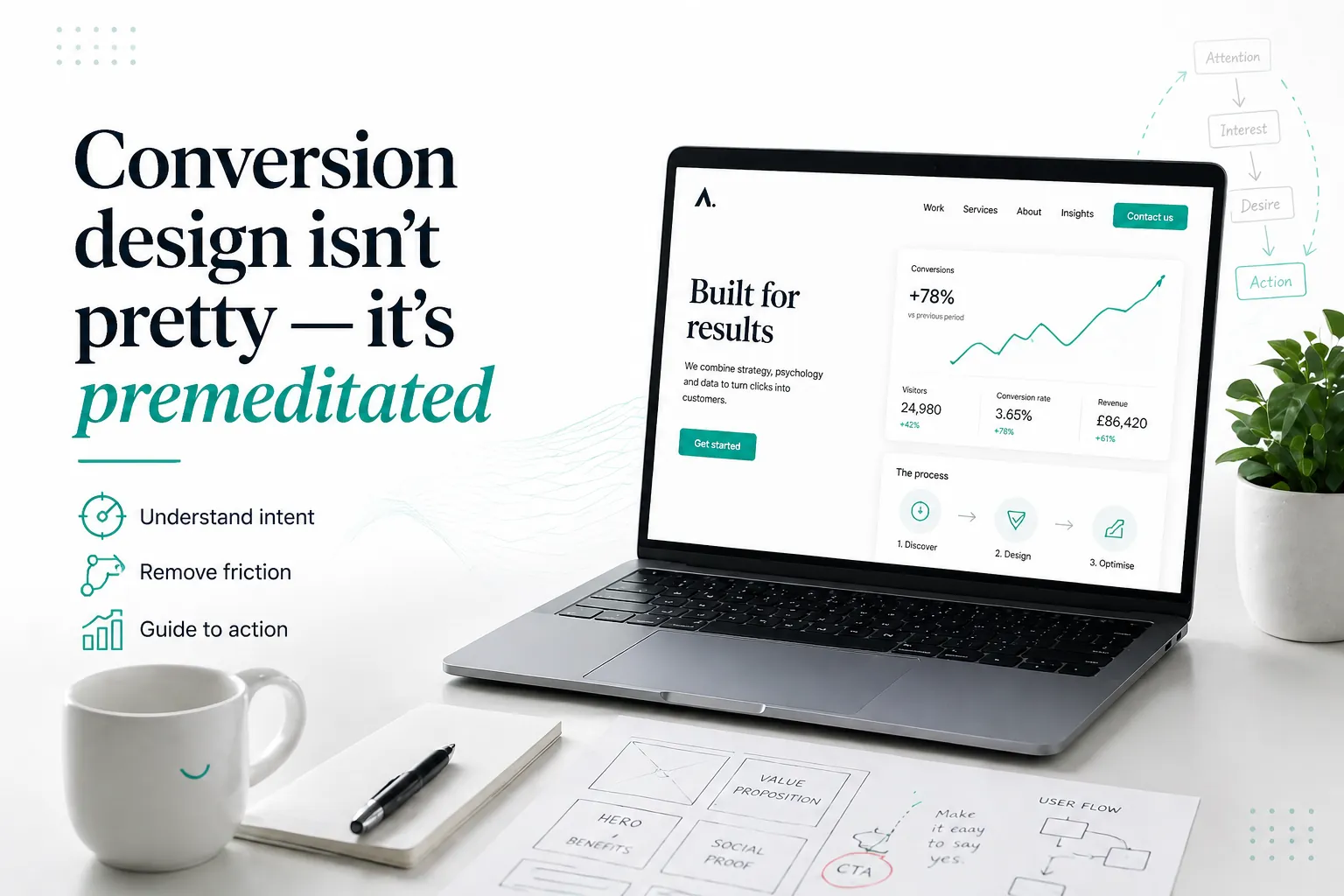
Every screen on a converting website should have an answer to one question: what is the next action this visitor takes, and what makes that action obvious? If you cannot say it in one sentence per screen, the screen is not pulling its weight.
On a renovation site, the next action is almost always 'book a 15-minute call.' Not 'request a quote.' Not 'see our services.' Not 'fill in this form so we can bombard you.' Book a call. So every screen should either be giving a reason to book the call, or providing the proof that makes booking the call feel safe.
The five shapes of a converting screen
- , Hero: what you do, who for, why care. CTA: book the call.
- , Proof: real photography, real numbers, real names. CTA: book the call.
- , Process: how the project goes, what they get, when. CTA: book the call.
- , Pricing: the floor, the range, the variables. CTA: book the call.
- , FAQ: every objection that ever stopped a booking. CTA: book the call.
Notice the CTA does not change. That is not laziness. That is premeditation. You are reducing decision load. The visitor never has to ask 'what now.'
The role of beauty
Beauty is not the enemy. Beauty signals competence. A site that looks well-made signals a business that is well-made. The mistake is treating beauty as the goal instead of the medium.
A beautiful site that does not convert is just an expensive sculpture.
Luca Planchais
When we hand a build over, we walk through it screen by screen and ask the same question for each: what is the next action, and is it obvious? If the answer is not yes within four seconds, we rebuild that screen.